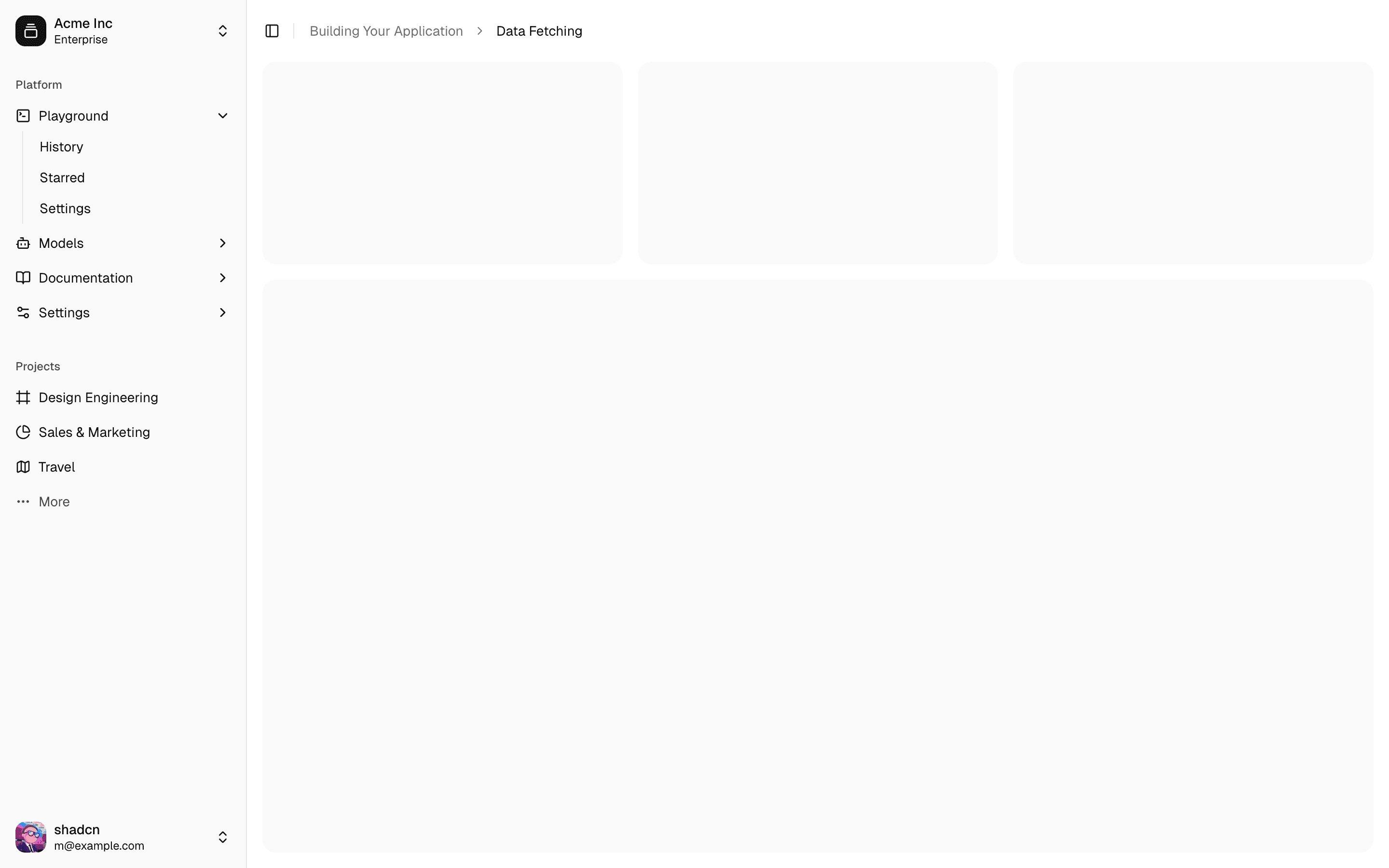
Sidebar
A composable, themeable and customizable sidebar component.

Sidebars are one of the most complex components to build. They are central to any application and often contain a lot of moving parts.
Shad doesn't like building sidebars, so he built 30+ of them with all kinds of configurations. The core components have been extracted into sidebar-*.svelte files, and you can use them in your own projects.
We now have a solid foundation to build on top of. Composable. Themeable. Customizable.
Installation
Run the following command to install the `sidebar` components:
Add the following colors to your CSS file
We'll go over the colors later in the theming section.
	:root {
  --sidebar: oklch(0.985 0 0);
  --sidebar-foreground: oklch(0.145 0 0);
  --sidebar-primary: oklch(0.205 0 0);
  --sidebar-primary-foreground: oklch(0.985 0 0);
  --sidebar-accent: oklch(0.97 0 0);
  --sidebar-accent-foreground: oklch(0.205 0 0);
  --sidebar-border: oklch(0.922 0 0);
  --sidebar-ring: oklch(0.708 0 0);
}

.dark {
  --sidebar: oklch(0.205 0 0);
  --sidebar-foreground: oklch(0.985 0 0);
  --sidebar-primary: oklch(0.488 0.243 264.376);
  --sidebar-primary-foreground: oklch(0.985 0 0);
  --sidebar-accent: oklch(0.269 0 0);
  --sidebar-accent-foreground: oklch(0.985 0 0);
  --sidebar-border: oklch(1 0 0 / 10%);
  --sidebar-ring: oklch(0.439 0 0);
}
Copy and paste the component source files linked at the top of this page into your project.
Add the following colors to your CSS file
We'll go over the colors later in the theming section.
	:root {
  --sidebar: oklch(0.985 0 0);
  --sidebar-foreground: oklch(0.145 0 0);
  --sidebar-primary: oklch(0.205 0 0);
  --sidebar-primary-foreground: oklch(0.985 0 0);
  --sidebar-accent: oklch(0.97 0 0);
  --sidebar-accent-foreground: oklch(0.205 0 0);
  --sidebar-border: oklch(0.922 0 0);
  --sidebar-ring: oklch(0.708 0 0);
}

.dark {
  --sidebar: oklch(0.205 0 0);
  --sidebar-foreground: oklch(0.985 0 0);
  --sidebar-primary: oklch(0.488 0.243 264.376);
  --sidebar-primary-foreground: oklch(0.985 0 0);
  --sidebar-accent: oklch(0.269 0 0);
  --sidebar-accent-foreground: oklch(0.985 0 0);
  --sidebar-border: oklch(1 0 0 / 10%);
  --sidebar-ring: oklch(0.439 0 0);
}
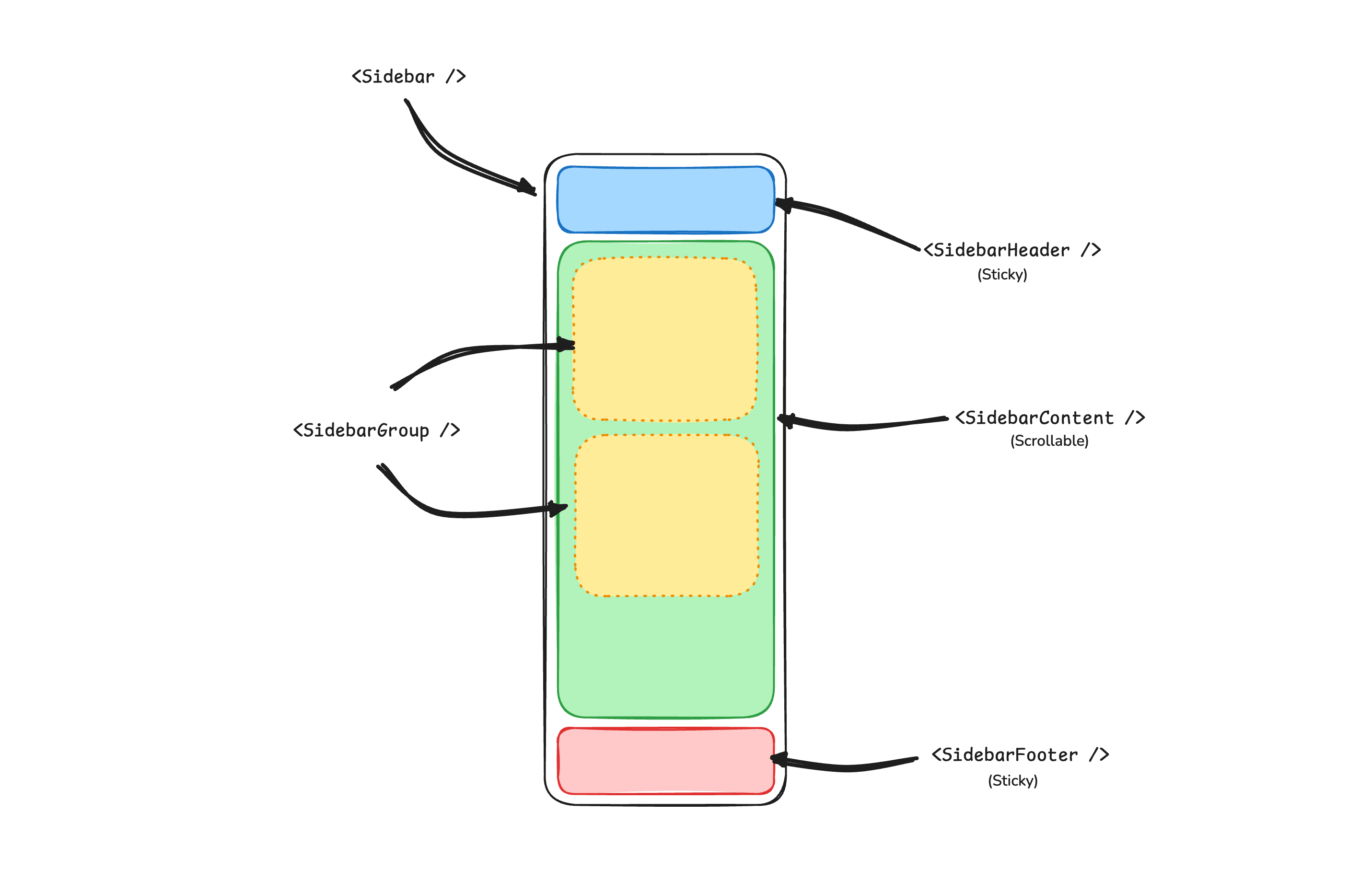
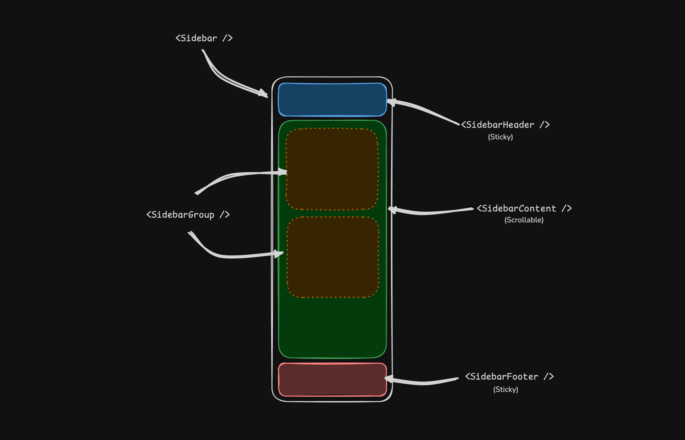
Structure
A Sidebar component is composed of the following parts:
Sidebar.Provider- Handles collapsible state.Sidebar.Root- The sidebar container.Sidebar.HeaderandSidebar.Footer- Sticky at the top and bottom of the sidebar.Sidebar.Content- Scrollable content.Sidebar.Group- Section within theSidebar.Content.Sidebar.Trigger- Trigger for theSidebar.
Usage
	<script lang="ts">
  import * as Sidebar from "$lib/components/ui/sidebar/index.js";
  import AppSidebar from "$lib/components/app-sidebar.svelte";

  let { children } = $props();
</script>

<Sidebar.Provider>
  <AppSidebar />
  <main>
    <Sidebar.Trigger />
    {@render children?.()}
  </main>
</Sidebar.Provider>
	<script lang="ts">
  import * as Sidebar from "$lib/components/ui/sidebar/index.js";
</script>

<Sidebar.Root>
  <Sidebar.Header />
  <Sidebar.Content>
    <Sidebar.Group />
    <Sidebar.Group />
  </Sidebar.Content>
  <Sidebar.Footer />
</Sidebar.Root>
Your First Sidebar
Let's start with the most basic sidebar. A collapsible sidebar with a menu.
Add a Sidebar.Provider and Sidebar.Trigger at the root of your application.
	<script lang="ts">
  import * as Sidebar from "$lib/components/ui/sidebar/index.js";
  import AppSidebar from "$lib/components/app-sidebar.svelte";

  let { children } = $props();
</script>

<Sidebar.Provider>
  <AppSidebar />
  <main>
    <Sidebar.Trigger />
    {@render children?.()}
  </main>
</Sidebar.Provider>
Create a new sidebar component at src/lib/components/app-sidebar.svelte.
	<script lang="ts">
  import * as Sidebar from "$lib/components/ui/sidebar/index.js";
</script>

<Sidebar.Root>
  <Sidebar.Content />
</Sidebar.Root>
Now, let's add a Sidebar.Menu to the sidebar.
We'll use the Sidebar.Menu component in a Sidebar.Group.
	<script lang="ts">
  import CalendarIcon from "@lucide/svelte/icons/calendar";
  import HouseIcon from "@lucide/svelte/icons/house";
  import InboxIcon from "@lucide/svelte/icons/inbox";
  import SearchIcon from "@lucide/svelte/icons/search";
  import SettingsIcon from "@lucide/svelte/icons/settings";
  import * as Sidebar from "$lib/components/ui/sidebar/index.js";

  // Menu items.
  const items = [
    {
      title: "Home",
      url: "#",
      icon: HouseIcon,
    },
    {
      title: "Inbox",
      url: "#",
      icon: InboxIcon,
    },
    {
      title: "Calendar",
      url: "#",
      icon: CalendarIcon,
    },
    {
      title: "Search",
      url: "#",
      icon: SearchIcon,
    },
    {
      title: "Settings",
      url: "#",
      icon: SettingsIcon,
    },
  ];
</script>

<Sidebar.Root>
  <Sidebar.Content>
    <Sidebar.Group>
      <Sidebar.GroupLabel>Application</Sidebar.GroupLabel>
      <Sidebar.GroupContent>
        <Sidebar.Menu>
          {#each items as item (item.title)}
            <Sidebar.MenuItem>
              <Sidebar.MenuButton>
                {#snippet child({ props })}
                  <a href={item.url} {...props}>
                    <item.icon />
                    <span>{item.title}</span>
                  </a>
                {/snippet}
              </Sidebar.MenuButton>
            </Sidebar.MenuItem>
          {/each}
        </Sidebar.Menu>
      </Sidebar.GroupContent>
    </Sidebar.Group>
  </Sidebar.Content>
</Sidebar.Root>
You've created your first sidebar.


Components
The components in the sidebar-*.svelte files are built to be composable i.e you build your sidebar by putting the provided components together. They also compose well with other shadcn-svelte components such as DropdownMenu, Collapsible, Dialog, etc.
If you need to change the code in the sidebar-*.svelte files, you are encouraged to do so. The code is yours. Use the provided components as a starting point to build your own
In the next sections, we'll go over each component and how to use them.
Sidebar.Provider
The Sidebar.Provider component is used to provide the sidebar context to the Sidebar component. You should always wrap your application in a Sidebar.Provider component.
Props
| Name | Type | Description |
|---|---|---|
open | boolean | Open state of the sidebar (bindable). |
onOpenChange | (open: boolean) => void | A callback fired after the open state of the sidebar changes if uncontrolled, and before the sidebar opens or closes if controlled. |
Width
If you have a single sidebar in your application, you can use the SIDEBAR_WIDTH and SIDEBAR_WIDTH_MOBILE constants in src/lib/components/ui/sidebar/constants.ts to set the width of the sidebar.
	export const SIDEBAR_WIDTH = "16rem";
export const SIDEBAR_WIDTH_MOBILE = "18rem";
For multiple sidebars in your application, you can use the style prop to set the width of the sidebar.
To set the width of the sidebar, you can use the --sidebar-width and --sidebar-width-mobile CSS variables in the style prop.
	<Sidebar.Provider
  style="--sidebar-width: 20rem; --sidebar-width-mobile: 20rem;"
>
  <Sidebar.Root />
</Sidebar.Provider>
This will not only handle the width of the sidebar but also the layout spacing.
Keyboard Shortcut
The SIDEBAR_KEYBOARD_SHORTCUT variable in src/lib/components/ui/sidebar/constants.ts is used to set the keyboard shortcut used to open and close the sidebar.
To trigger the sidebar, you use the cmd+b keyboard shortcut on Mac and ctrl+b on Windows.
You can change the keyboard shortcut by changing the value of the SIDEBAR_KEYBOARD_SHORTCUT variable.
export const SIDEBAR_KEYBOARD_SHORTCUT = "b";
Sidebar.Root
The main Sidebar component used to render a collapsible sidebar.
	<script lang="ts">
  import * as Sidebar from "$lib/components/ui/sidebar/index.js";
</script>

<Sidebar.Root />
Props
| Property | Type | Description |
|---|---|---|
side | left or right | The side of the sidebar. |
variant | sidebar, floating, or inset | The variant of the sidebar. |
collapsible | offcanvas, icon, or none | Collapsible state of the sidebar. |
side
Use the side prop to change the side of the sidebar.
Available options are left and right.
<Sidebar.Root side="left | right" />
variant
Use the variant prop to change the variant of the sidebar.
Available options are sidebar, floating and inset.
<Sidebar.Root variant="sidebar | floating | inset" />
Note: If you use the inset variant, remember to wrap your main content
in a SidebarInset component.
	<Sidebar.Provider>
  <Sidebar.Root variant="inset">
    <Sidebar.Inset>
      <main>
        <!-- Your main content -->
      </main>
    </Sidebar.Inset>
  </Sidebar.Root>
</Sidebar.Provider>
collapsible
Use the collapsible prop to make the sidebar collapsible.
Available options are offcanvas, icon and none.
<Sidebar.Root collapsible="offcanvas | icon | none" />
| Prop | Description |
|---|---|
offcanvas | A collapsible sidebar that slides in from the left or right. |
icon | A sidebar that collapses to icons. |
none | A non-collapsible sidebar. |
useSidebar
The useSidebar function is used to hook into the sidebar context. It returns a reactive class instance, so it cannot be destructured. Additionally, it must be called during the lifecycle of the component.
	<script lang="ts">
  import { useSidebar } from "$lib/components/ui/sidebar/index.js";

  sidebar.state;
  sidebar.isMobile;
  sidebar.toggle();
</script>
| Property | Type | Description |
|---|---|---|
state | expanded or collapsed | The current state of the sidebar. |
open | boolean | Whether the sidebar is open. |
setOpen | (open: boolean) => void | Sets the open state of the sidebar. |
openMobile | boolean | Whether the sidebar is open on mobile. |
setOpenMobile | (open: boolean) => void | Sets the open state of the sidebar on mobile. |
isMobile | boolean | Whether the sidebar is on mobile. |
toggle | () => void | Toggles the sidebar. Desktop and mobile. |
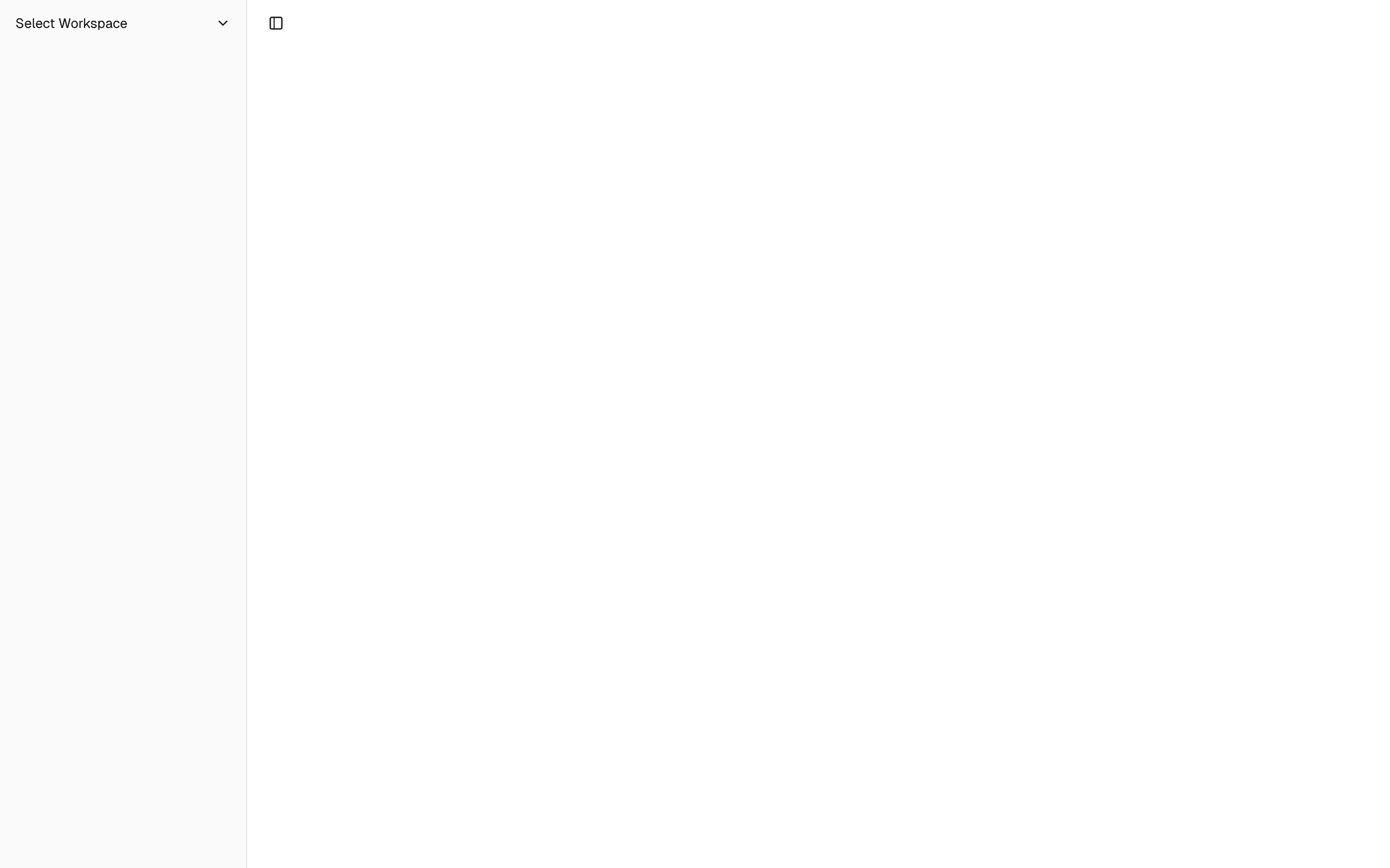
Sidebar.Header
Use the Sidebar.Header component to add a sticky header to the sidebar.
The following example adds a <DropdownMenu> to the Sidebar.Header.

	<Sidebar.Root>
  <Sidebar.Header>
    <Sidebar.Menu>
      <Sidebar.MenuItem>
        <DropdownMenu.Root>
          <DropdownMenu.Trigger>
            {#snippet child({ props })}
              <Sidebar.MenuButton {...props}>
                Select Workspace
                <ChevronDown class="ml-auto" />
              </Sidebar.MenuButton>
            {/snippet}
          </DropdownMenu.Trigger>
          <DropdownMenu.Content class="w-(--bits-dropdown-menu-anchor-width)">
            <DropdownMenu.Item>
              <span>Acme Inc</span>
            </DropdownMenu.Item>
            <DropdownMenu.Item>
              <span>Acme Corp.</span>
            </DropdownMenu.Item>
          </DropdownMenu.Content>
        </DropdownMenu.Root>
      </Sidebar.MenuItem>
    </Sidebar.Menu>
  </Sidebar.Header>
</Sidebar.Root>
Sidebar.Footer
Use the Sidebar.Footer component to add a sticky footer to the sidebar.
The following example adds a <DropdownMenu> to the Sidebar.Footer.

	<Sidebar.Provider>
  <Sidebar.Root>
    <Sidebar.Header />
    <Sidebar.Content />
    <Sidebar.Footer>
      <Sidebar.Menu>
        <Sidebar.MenuItem>
          <DropdownMenu.Root>
            <DropdownMenu.Trigger>
              {#snippet child({ props })}
                <Sidebar.MenuButton
                  {...props}
                  class="data-[state=open]:bg-sidebar-accent data-[state=open]:text-sidebar-accent-foreground"
                >
                  Username
                  <ChevronUp class="ml-auto" />
                </Sidebar.MenuButton>
              {/snippet}
            </DropdownMenu.Trigger>
            <DropdownMenu.Content
              side="top"
              class="w-(--bits-dropdown-menu-anchor-width)"
            >
              <DropdownMenu.Item>
                <span>Account</span>
              </DropdownMenu.Item>
              <DropdownMenu.Item>
                <span>Billing</span>
              </DropdownMenu.Item>
              <DropdownMenu.Item>
                <span>Sign out</span>
              </DropdownMenu.Item>
            </DropdownMenu.Content>
          </DropdownMenu.Root>
        </Sidebar.MenuItem>
      </Sidebar.Menu>
    </Sidebar.Footer>
  </Sidebar.Root>
  <Sidebar.Inset>
    <header class="flex h-12 items-center justify-between px-4">
      <Sidebar.Trigger />
    </header>
  </Sidebar.Inset>
</Sidebar.Provider>
Sidebar.Content
The Sidebar.Content component is used to wrap the content of the sidebar. This is where you add your Sidebar.Group components. It is scrollable.
	<Sidebar.Root>
  <Sidebar.Content>
    <Sidebar.Group />
    <Sidebar.Group />
  </Sidebar.Content>
</Sidebar.Root>
Sidebar.Group
Use the Sidebar.Group component to create a section within the sidebar.
A Sidebar.Group has a Sidebar.GroupLabel, a Sidebar.GroupContent and an optional Sidebar.GroupAction.

	<Sidebar.Root>
  <Sidebar.Content>
    <Sidebar.Group>
      <Sidebar.GroupLabel>Application</Sidebar.GroupLabel>
      <Sidebar.GroupAction>
        <Plus /> <span class="sr-only">Add Project</span>
      </Sidebar.GroupAction>
      <Sidebar.GroupContent></Sidebar.GroupContent>
    </Sidebar.Group>
  </Sidebar.Content>
</Sidebar.Root>
Collapsible Sidebar.Group
To make a Sidebar.Group collapsible, wrap it in a Collapsible.

	<Collapsible.Root open class="group/collapsible">
  <Sidebar.Group>
    <Sidebar.GroupLabel>
      {#snippet child({ props })}
        <Collapsible.Trigger {...props}>
          Help
          <ChevronDown
            class="ml-auto transition-transform group-data-[state=open]/collapsible:rotate-180"
          />
        </Collapsible.Trigger>
      {/snippet}
    </Sidebar.GroupLabel>
    <Collapsible.Content>
      <Sidebar.GroupContent />
    </Collapsible.Content>
  </Sidebar.Group>
</Collapsible.Root>
Note: We wrap the Collapsible.Trigger in a Sidebar.GroupLabel to render
a button.
Sidebar.GroupAction
Use the Sidebar.GroupAction component to add an action to a Sidebar.Group.
	<Sidebar.Group>
  <Sidebar.GroupLabel>Projects</Sidebar.GroupLabel>
  <Sidebar.GroupAction title="Add Project">
    <Plus /> <span class="sr-only">Add Project</span>
  </Sidebar.GroupAction>
  <Sidebar.GroupContent />
</Sidebar.Group>

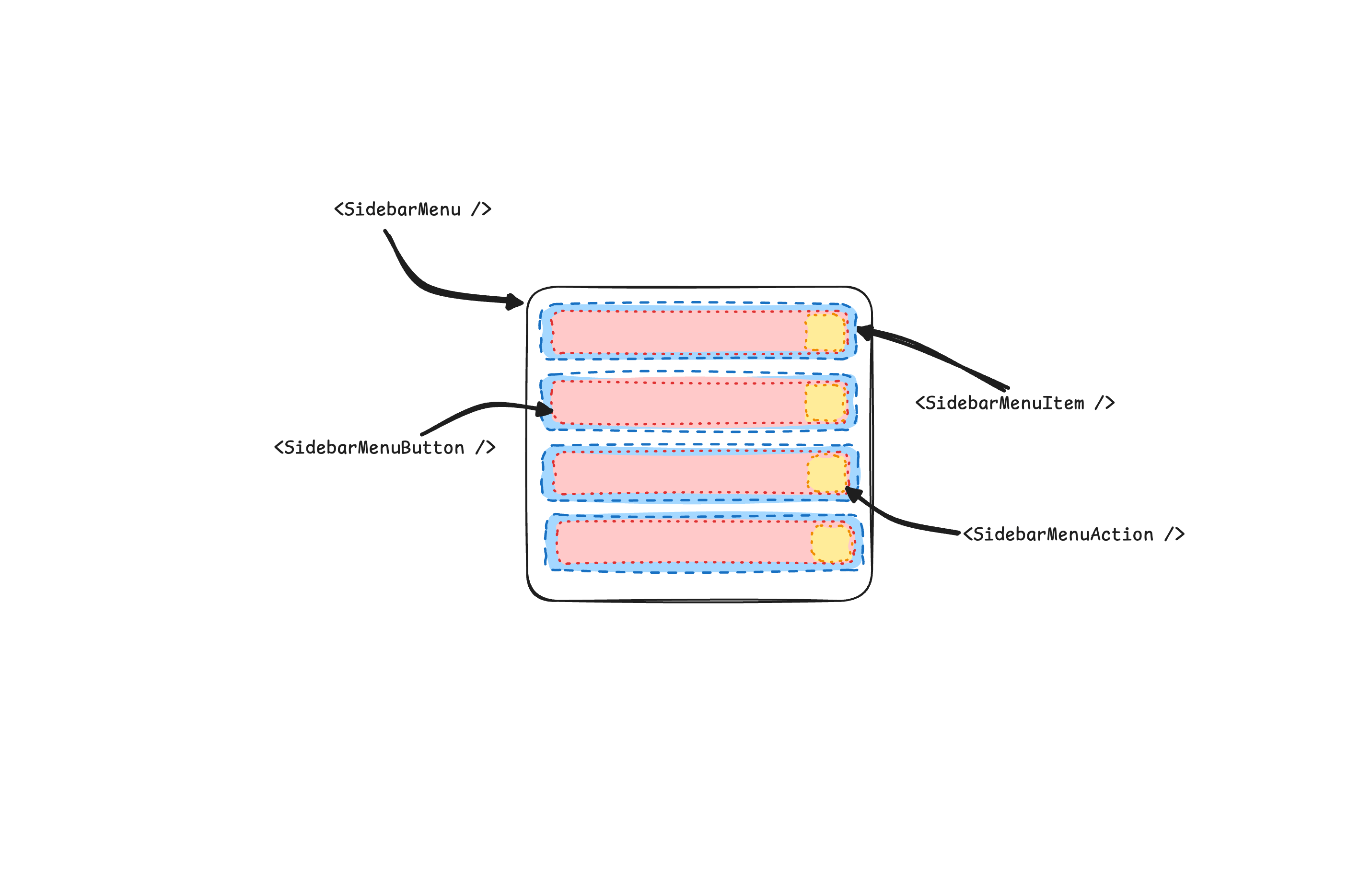
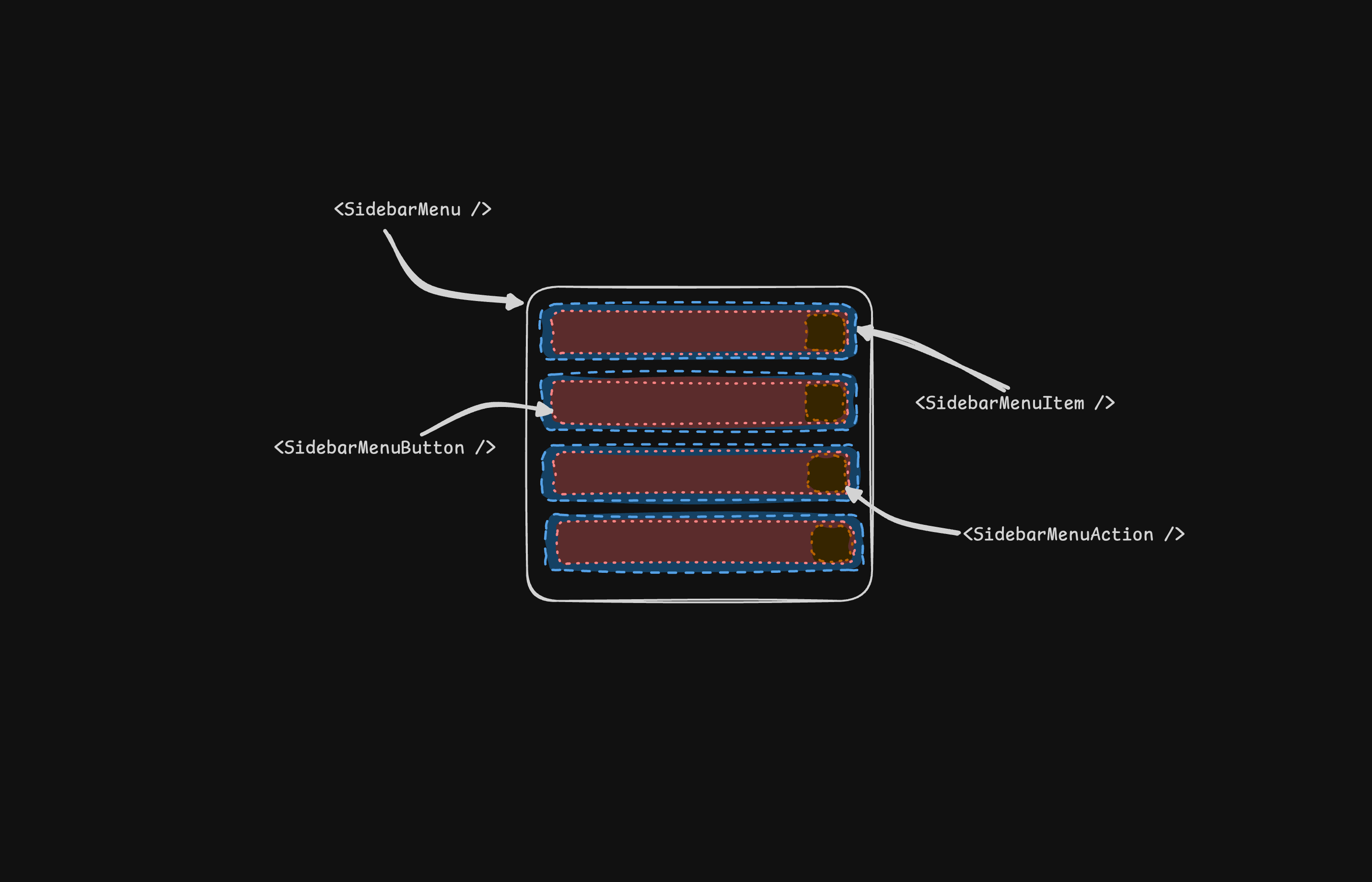
Sidebar.Menu
The Sidebar.Menu component is used for building a menu within a Sidebar.Group.
A Sidebar.Menu is composed of Sidebar.MenuItem, Sidebar.MenuButton, Sidebar.MenuAction, and Sidebar.MenuSub components.
Here's an example of a Sidebar.Menu component rendering a list of projects.

	<Sidebar.Root>
  <Sidebar.Content>
    <Sidebar.Group>
      <Sidebar.GroupLabel>Projects</Sidebar.GroupLabel>
      <Sidebar.GroupContent>
        <Sidebar.Menu>
          {#each projects as project}
            <Sidebar.MenuItem>
              <Sidebar.MenuButton>
                {#snippet child({ props })}
                  <a href={project.url} {...props}>
                    <project.icon />
                    <span>{project.name}</span>
                  </a>
                {/snippet}
              </Sidebar.MenuButton>
            </Sidebar.MenuItem>
          {/each}
        </Sidebar.Menu>
      </Sidebar.GroupContent>
    </Sidebar.Group>
  </Sidebar.Content>
</Sidebar.Root>
Sidebar.MenuButton
The Sidebar.MenuButton component is used to render a menu button within a Sidebar.Menu.
Link or Anchor
By default, the Sidebar.MenuButton renders a button, but you can use the child snippet to render a different component such as an <a> tag.
	<Sidebar.MenuButton>
  {#snippet child({ props })}
    <a href="/home" {...props}> Home </a>
  {/snippet}
</Sidebar.MenuButton>
Icon and Label
You can render an icon and a truncated label inside the button. Remember to wrap the label in a <span> tag.
	<Sidebar.MenuButton>
  {#snippet child({ props })}
    <a href="/home" {...props}>
      <House />
      <span>Home</span>
    </a>
  {/snippet}
</Sidebar.MenuButton>
isActive
Use the isActive prop to mark a menu item as active.
	<Sidebar.MenuButton isActive>
  {#snippet child({ props })}
    <a href="/home" {...props}>
      <House />
      <span>Home</span>
    </a>
  {/snippet}
</Sidebar.MenuButton>
Sidebar.MenuAction
The Sidebar.MenuAction component is used to render a menu action within a Sidebar.Menu.
This button works independently of the Sidebar.MenuButton, i.e. you can have the Sidebar.MenuButton as a clickable link and the Sidebar.MenuAction as a button.
	<Sidebar.MenuItem>
  <Sidebar.MenuButton>
    {#snippet child({ props })}
      <a href="/home" {...props}>
        <House />
        <span>Home</span>
      </a>
    {/snippet}
  </Sidebar.MenuButton>
  <Sidebar.MenuAction>
    <Plus /> <span class="sr-only">Add Project</span>
  </Sidebar.MenuAction>
</Sidebar.MenuItem>
DropdownMenu
Here's an example of a Sidebar.MenuAction that renders a DropdownMenu.


	<Sidebar.MenuItem>
  <Sidebar.MenuButton>
    {#snippet child({ props })}
      <a href="#" {...props}>
        <House />
        <span>Home</span>
      </a>
    {/snippet}
  </Sidebar.MenuButton>
  <DropdownMenu.Root>
    <DropdownMenu.Trigger>
      {#snippet child({ props })}
        <Sidebar.MenuAction {...props}>
          <Ellipsis />
        </Sidebar.MenuAction>
      {/snippet}
    </DropdownMenu.Trigger>
    <DropdownMenu.Content side="right" align="start">
      <DropdownMenu.Item>
        <span>Edit Project</span>
      </DropdownMenu.Item>
      <DropdownMenu.Item>
        <span>Delete Project</span>
      </DropdownMenu.Item>
    </DropdownMenu.Content>
  </DropdownMenu.Root>
</Sidebar.MenuItem>
Sidebar.MenuSub
The Sidebar.MenuSub component is used to render a submenu within a Sidebar.Menu.
Use Sidebar.MenuSubItem and Sidebar.MenuSubButton to render a submenu item.

	<Sidebar.MenuItem>
  <Sidebar.MenuButton />
  <Sidebar.MenuSub>
    <Sidebar.MenuSubItem>
      <Sidebar.MenuSubButton />
    </Sidebar.MenuSubItem>
    <Sidebar.MenuSubItem>
      <Sidebar.MenuSubButton />
    </Sidebar.MenuSubItem>
  </Sidebar.MenuSub>
</Sidebar.MenuItem>
Collapsible Sidebar.Menu
To make a Sidebar.Menu collapsible, wrap it and the Sidebar.MenuSub components in a Collapsible.


	<Sidebar.Menu>
  <Collapsible.Root open class="group/collapsible">
    <Sidebar.MenuItem>
      <Collapsible.Trigger>
        {#snippet child({ props })}
          <Sidebar.MenuButton {...props} />
        {/snippet}
      </Collapsible.Trigger>
      <Collapsible.Content>
        <Sidebar.MenuSub>
          <Sidebar.MenuSubItem />
        </Sidebar.MenuSub>
      </Collapsible.Content>
    </Sidebar.MenuItem>
  </Collapsible.Root>
</Sidebar.Menu>
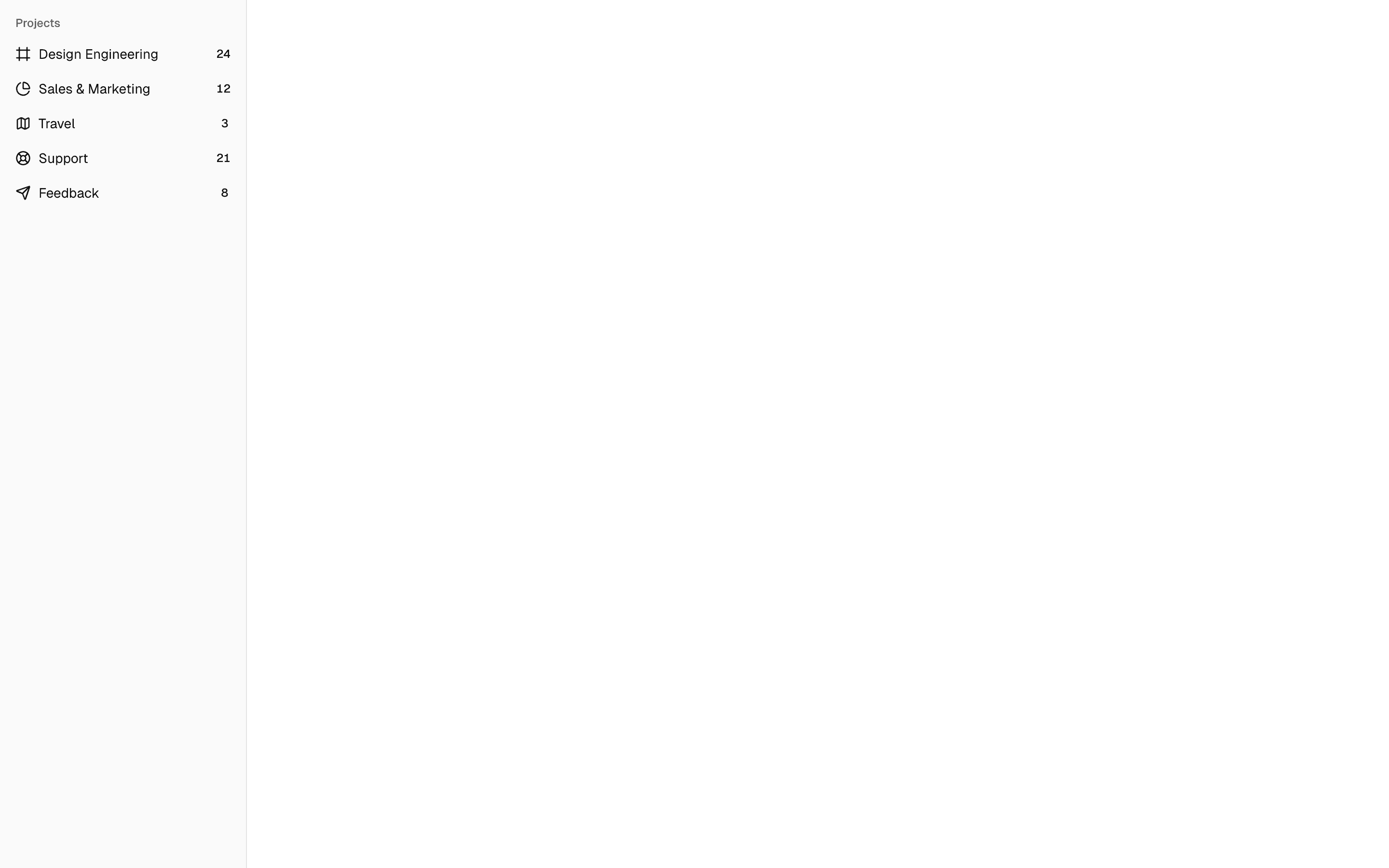
Sidebar.MenuBadge
The Sidebar.MenuBadge component is used to render a badge within a Sidebar.MenuItem.
	<Sidebar.MenuItem>
  <Sidebar.MenuButton />
  <Sidebar.MenuBadge>24</Sidebar.MenuBadge>
</Sidebar.MenuItem>
Sidebar.MenuSkeleton
The Sidebar.MenuSkeleton component is used to render a skeleton within a Sidebar.MenuItem. You can use this to show a loading state while waiting for data to load.
	<Sidebar.Menu>
  {#each Array.from({ length: 5 }) as _, index (index)}
    <Sidebar.MenuItem>
      <Sidebar.MenuSkeleton />
    </Sidebar.MenuItem>
  {/each}
</Sidebar.Menu>
Sidebar.Separator
The Sidebar.Separator component is used to render a separator within a Sidebar.
	<Sidebar.Root>
  <Sidebar.Header />
  <Sidebar.Separator />
  <Sidebar.Content>
    <Sidebar.Group />
    <Sidebar.Separator />
    <Sidebar.Group />
  </Sidebar.Content>
</Sidebar.Root>
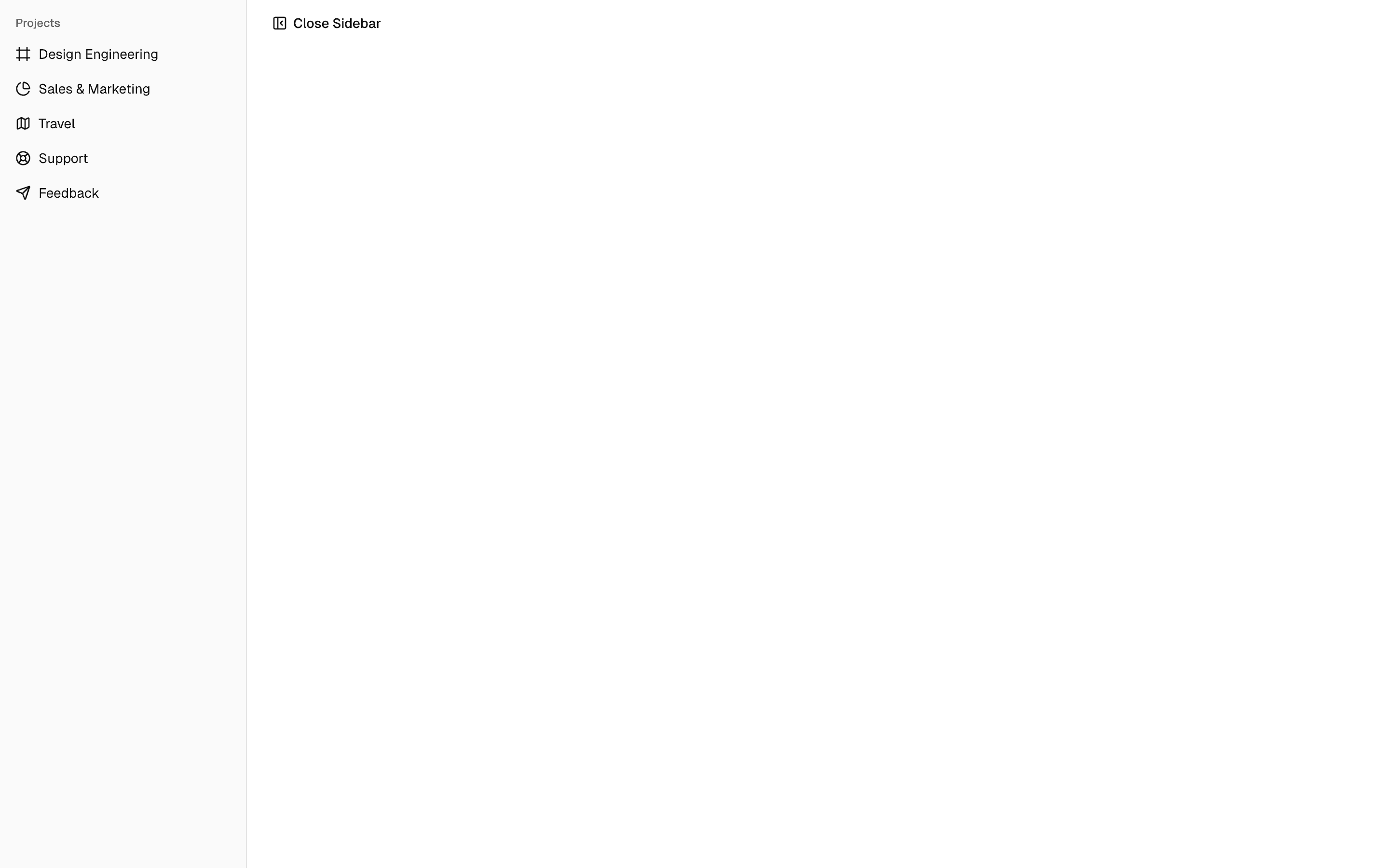
Sidebar.Trigger
Use the Sidebar.Trigger component to render a button that toggles the sidebar.
The Sidebar.Trigger component must be used within a Sidebar.Provider.
	<Sidebar.Provider>
  <Sidebar.Root />
  <main>
    <Sidebar.Trigger />
  </main>
</Sidebar.Provider>
Custom Trigger
To create a custom trigger, you can use the useSidebar hook.
	<script lang="ts">
  import { useSidebar } from "$lib/components/ui/sidebar/index.js";
  const sidebar = useSidebar();
</script>

<button onclick={() => sidebar.toggle()}>Toggle Sidebar</button>
Sidebar.Rail
The Sidebar.Rail component is used to render a rail within a Sidebar.Root. This rail can be used to toggle the sidebar.
	<Sidebar.Root>
  <Sidebar.Header />
  <Sidebar.Content>
    <Sidebar.Group />
  </Sidebar.Content>
  <Sidebar.Footer />
  <Sidebar.Rail />
</Sidebar.Root>
Controlled Sidebar
Use Svelte's Function Binding to control the sidebar state.

	<script lang="ts">
  import * as Sidebar from "$lib/components/ui/sidebar/index.js";

  let myOpen = $state(true);
</script>

<Sidebar.Provider bind:open={() => myOpen, (newOpen) => (myOpen = newOpen)}>
  <Sidebar.Root />
</Sidebar.Provider>

<!-- or -->

<Sidebar.Provider bind:open>
  <Sidebar.Root />
</Sidebar.Provider>
Theming
We use the following CSS variables to theme the sidebar.
	:root {
  --sidebar: oklch(0.985 0 0);
  --sidebar-foreground: oklch(0.145 0 0);
  --sidebar-primary: oklch(0.205 0 0);
  --sidebar-primary-foreground: oklch(0.985 0 0);
  --sidebar-accent: oklch(0.97 0 0);
  --sidebar-accent-foreground: oklch(0.205 0 0);
  --sidebar-border: oklch(0.922 0 0);
  --sidebar-ring: oklch(0.708 0 0);
}

.dark {
  --sidebar: oklch(0.205 0 0);
  --sidebar-foreground: oklch(0.985 0 0);
  --sidebar-primary: oklch(0.488 0.243 264.376);
  --sidebar-primary-foreground: oklch(0.985 0 0);
  --sidebar-accent: oklch(0.269 0 0);
  --sidebar-accent-foreground: oklch(0.985 0 0);
  --sidebar-border: oklch(1 0 0 / 10%);
  --sidebar-ring: oklch(0.439 0 0);
}
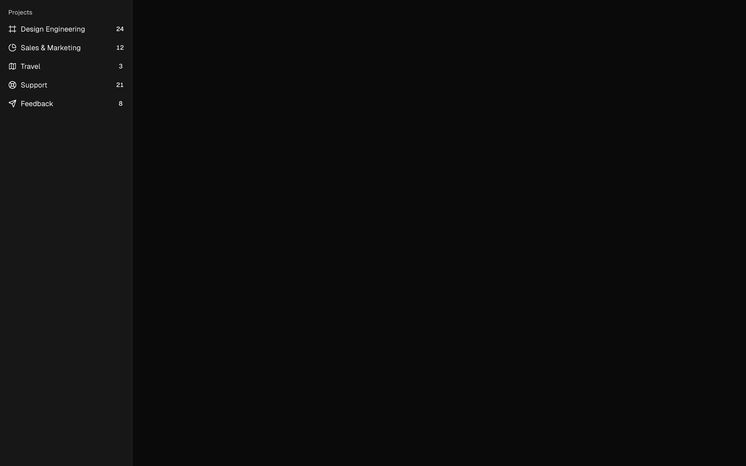
We intentionally use different variables for the sidebar and the rest of the application to make it easy to have a sidebar that is styled differently from the rest of the application. Think a sidebar with a darker shade from the main application.
Styling
Here are some tips for styling the sidebar based on different states.
- Styling an element based on the sidebar collapsible state. The following will hide the
Sidebar.Groupwhen the sidebar is iniconmode.
	<Sidebar.Root collapsible="icon">
  <Sidebar.Content>
    <Sidebar.Group class="group-data-[collapsible=icon]:hidden" />
  </Sidebar.Content>
</Sidebar.Root>
- Styling a menu action based on the menu button active state. The following will force the menu action to be visible when the menu button is active.
	<Sidebar.MenuItem>
  <Sidebar.MenuButton />
  <Sidebar.MenuAction
    class="peer-data-[active=true]/menu-button:opacity-100"
  />
</Sidebar.MenuItem>
You can find more tips on using states for styling in this Twitter thread.